Cyren
Cyren have a line of cloud-based products in the Internet security field and have been my client for over 2 years
To comply with my confidentiality agreement, I have omitted some information in this case study.
www.cyren.com
Background
Cyren have a line of cloud-based products in the Internet security field. Their systems support 550 million users in 190 different countries.
At first, I did a very minor UI facelift - things that can be implemented quickly and make things look a little better, a little clearer and little more consistent. Most of the work was around UX - new features and improvements. After almost 2 years of working together, we finally had the time and the resources to do bigger updates to the whole system - both UX and UI.
Our Users

IT Proffesionals
Small-medium size businesses & enterprise

Partners
Companies who can offer Cyren’s products

Cyren Spport
Company’s own support agents
The Process
At first, a lot of emphasis was on bringing the most value to the users while allowing Cyren’s developers to move quickly. This meant, for example, creating a visual language that could be created easily with CSS, using Font Awesome for icons and Bootstrap Framework and mostly - having a constant communication channel with the team.
Each new area or feature had a kickoff meeting with the PM’s and the developers, and we made sure to always test our decisions against real users’ feedback. Being able to implement the designs quickly also meant we could get them in front of real users quickly and learn.
Drill Downs
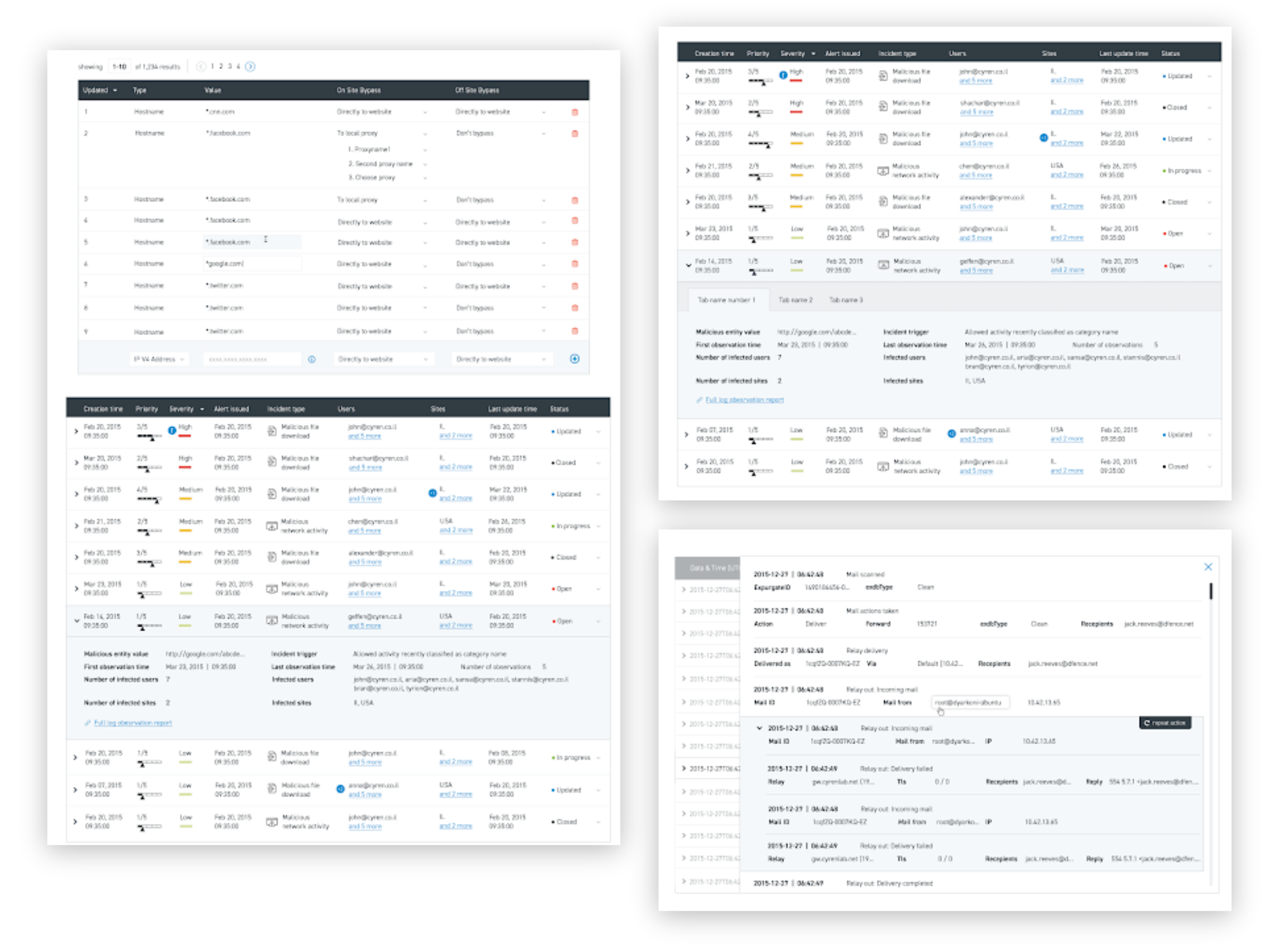
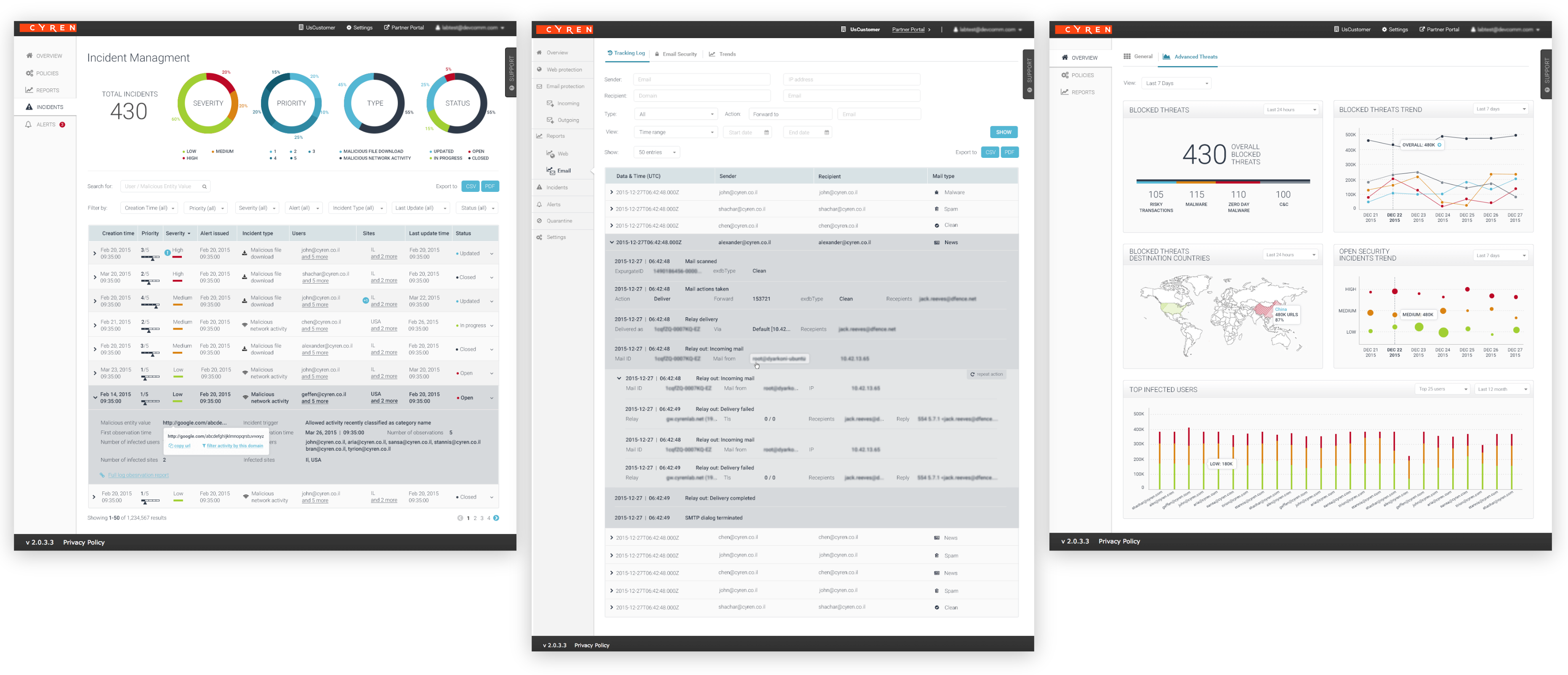
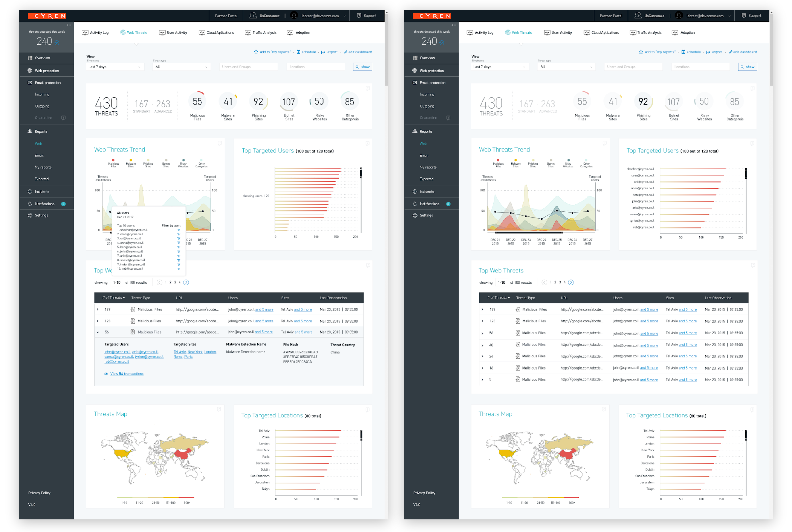
There is a lot of information to be shown on each page, so I created a UI that shows some base numbers and data without overwhelming the user, but can be always expanded to get more and more details as needed.
For example: each row in the table can be expanded and more data is available in small popups the user can trigger.
We also worked on information architecture and hierarchy inside each page and created a color and icon languages to give the user some visual cues - for example, severity level of a threat or icons that mark fields with new information.
Dashboard
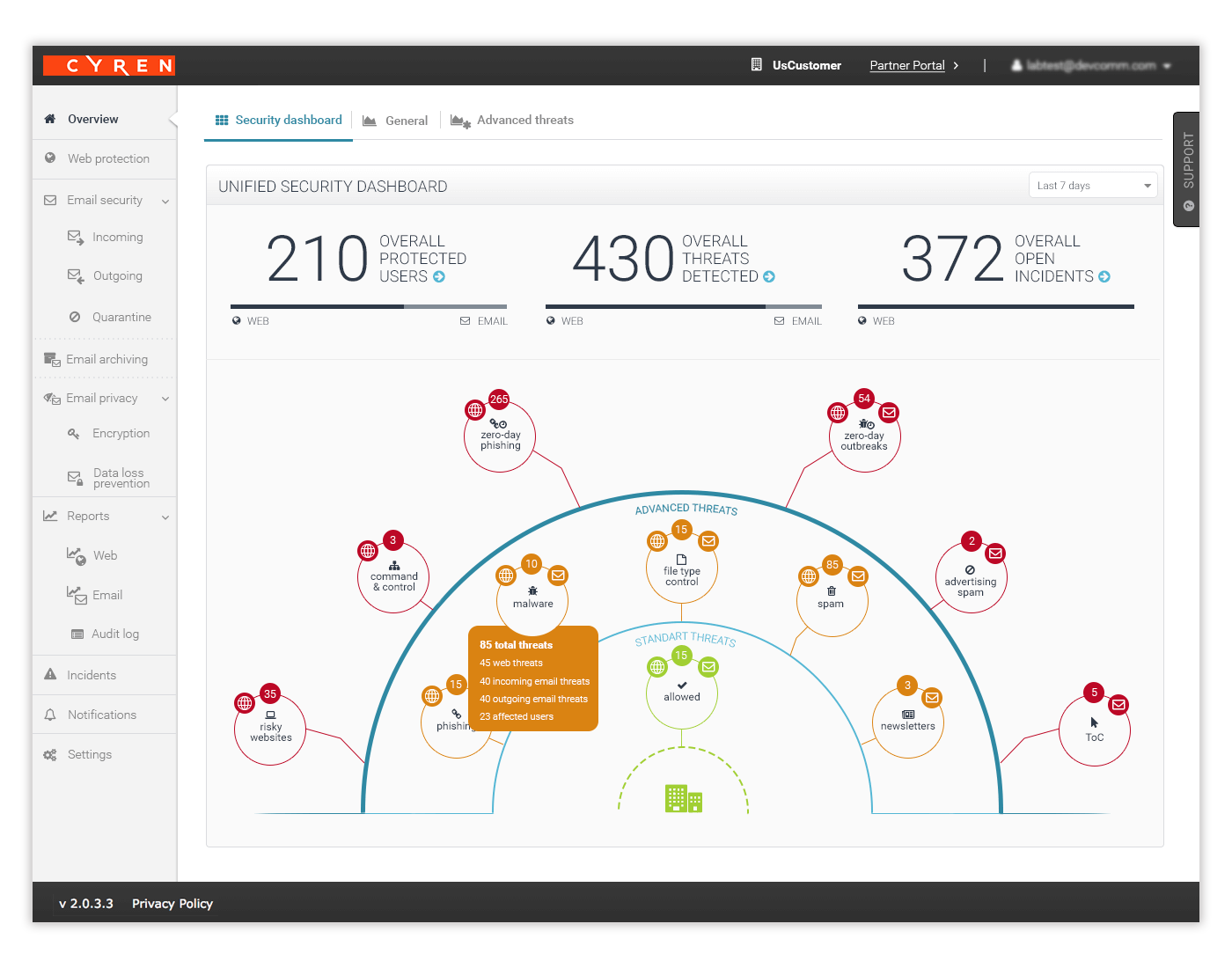
My biggest challenge for this project was the main dashboard. I needed to find a balance between something impressive and “cool” the marketing department needed, and keeping the interface usable and clear.
We used a metaphor of a shield/iron dome, which worked well with the 3 tiers - items that are allowed in, standart threats and advanced threats.
For each element the user could see if it’s web or email - 2 different services + how many incidents were there. For each category, the user could drill in and get detailed reports.
Side Projects
Cyren has added new products through acquisition of a few companies, which required merging those products with the base system. There were also few standalone products I designed for Cyren:
- Confluence look
- Emails
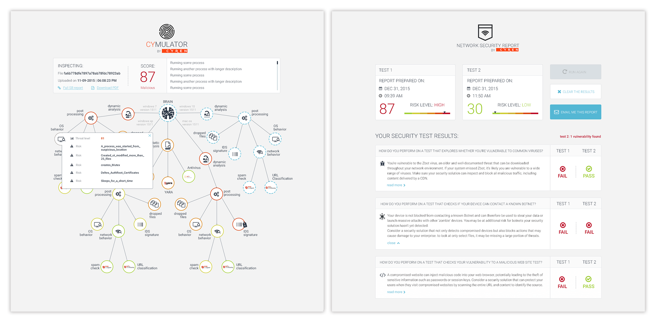
- Web Security Diagnostic tool and Cymulator tool which started out as hackathon projects and got a lot of positive responses when presented at the yearly RSA conferences
Redesign
After almost 2 years, we finally had the time and the people to work on really improving the UI and doing some general UX improvements.
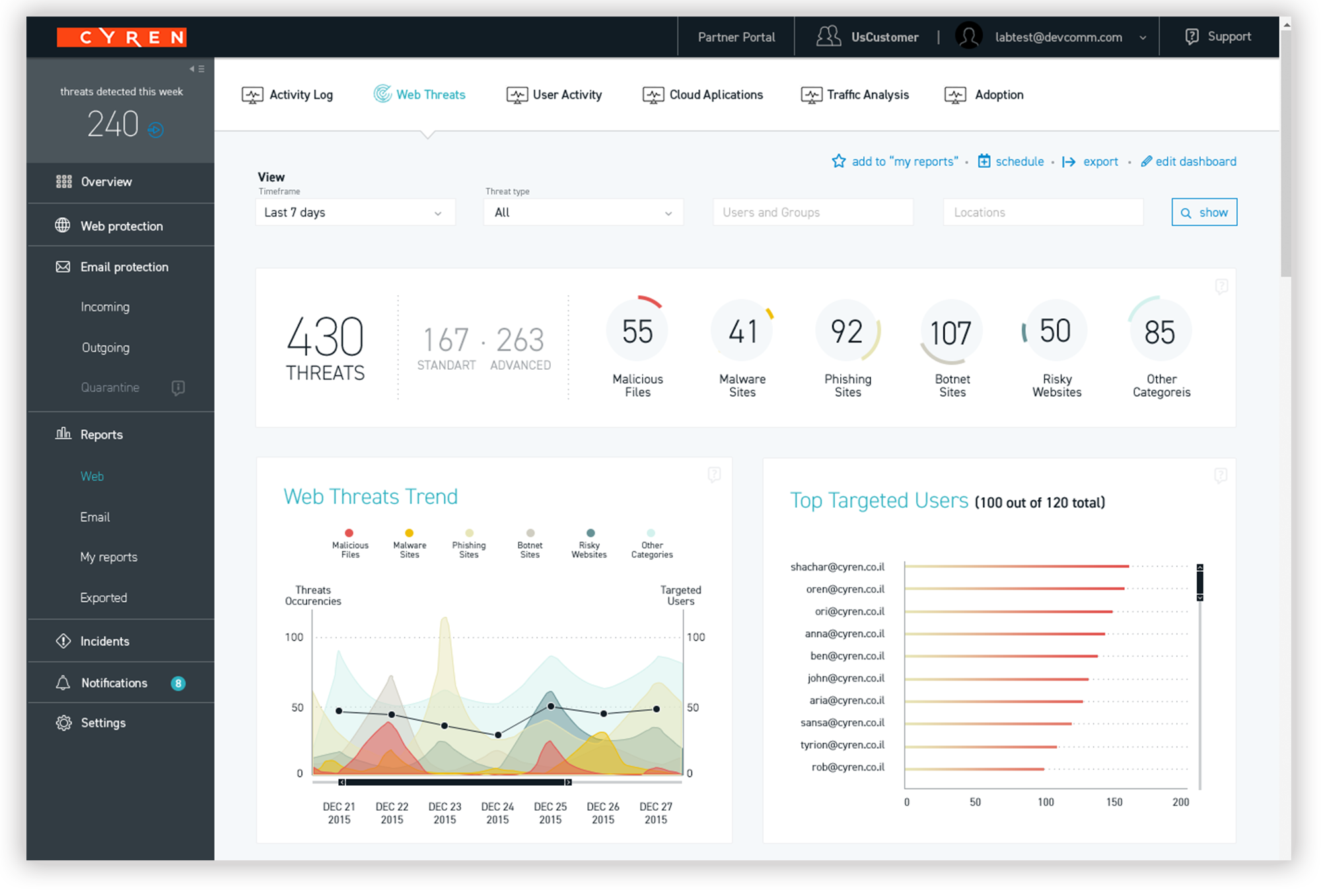
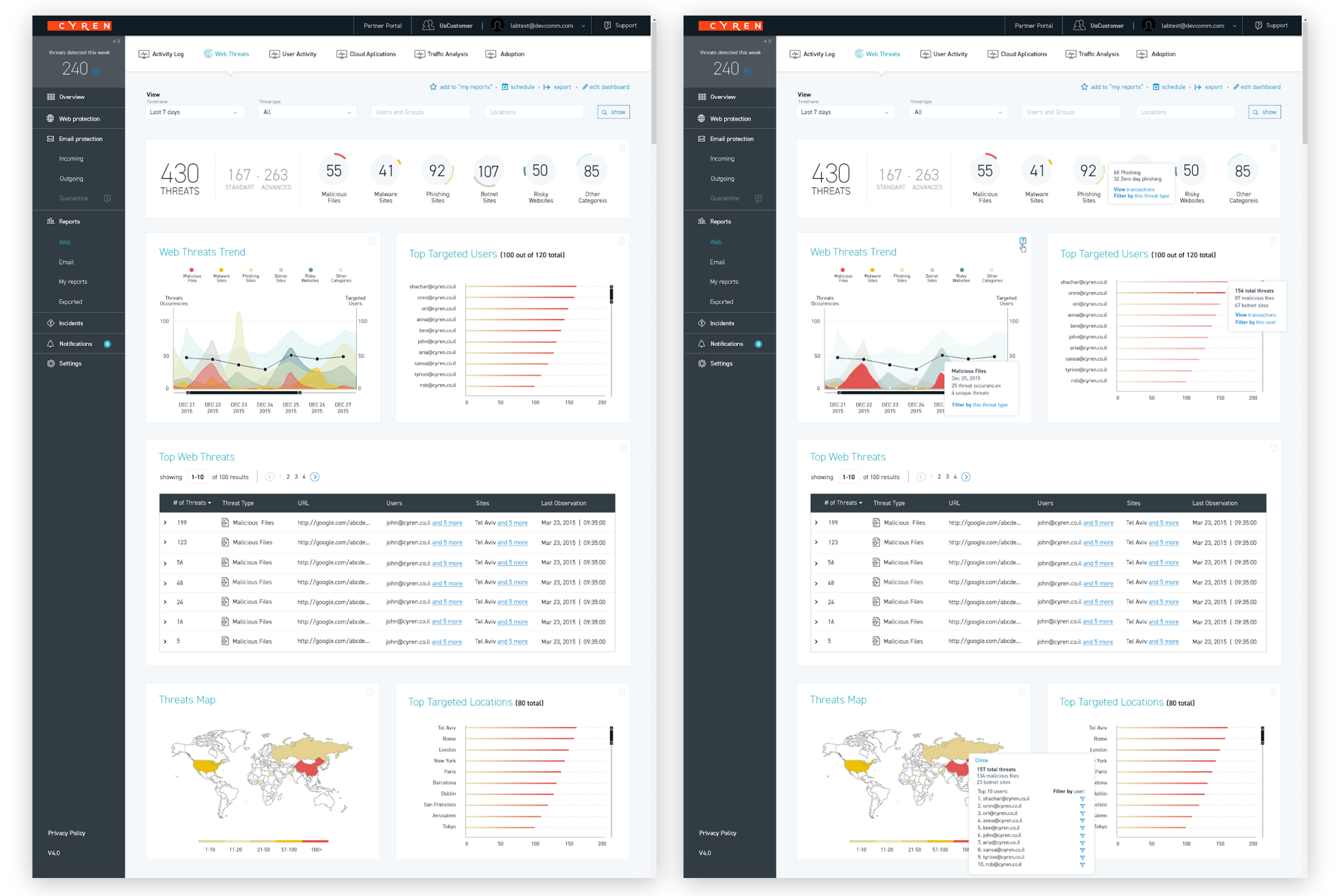
I reorganized the pages, to create a clearer hierarchy and help the user focus on specific pieces of data. For example - the number of threats is always in the left top corner; then, at the top of the page, the numbers area that represents all the threats but also all the threat types. Each threat type had its own color based on severity.
Advanced Reports
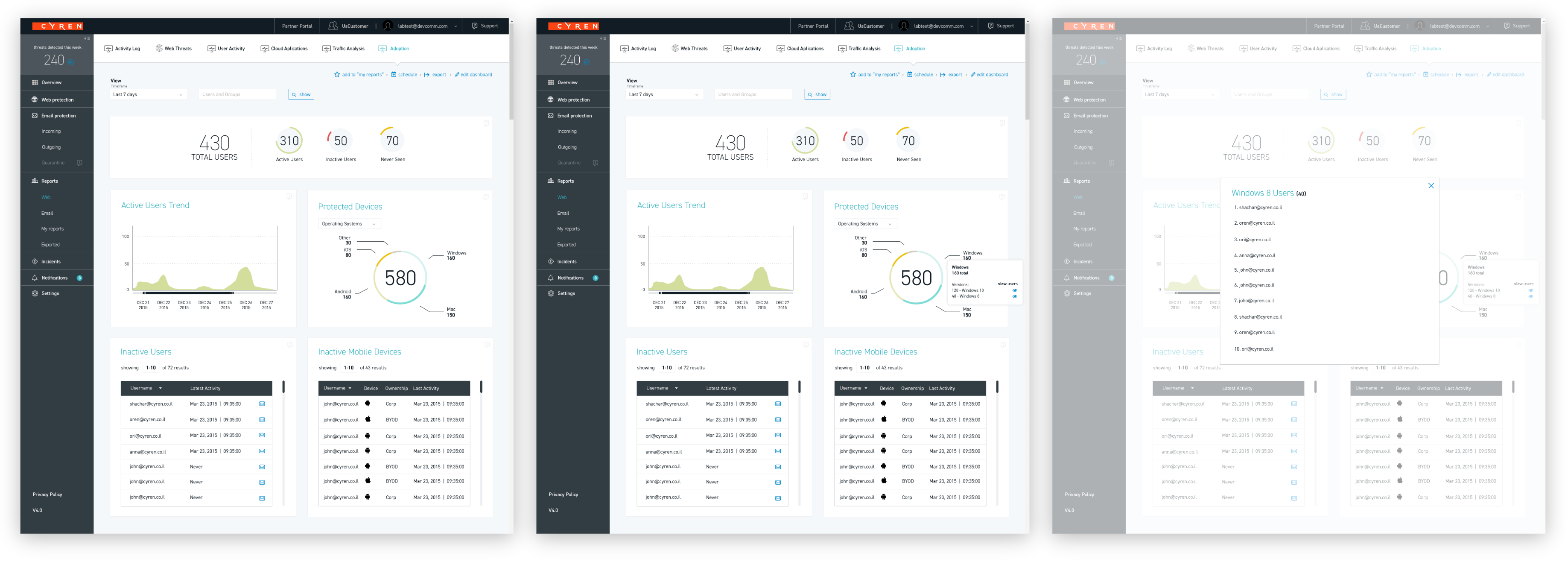
We created a much more advanced filtering system for the reports and kept - and enhanced - the drill in capabilities. For example - the user can zoom in into each chart and click on different areas to bring different details and data.
All the information in each page can be filtered using other data on the page, such as a specific incident type or a specific user.
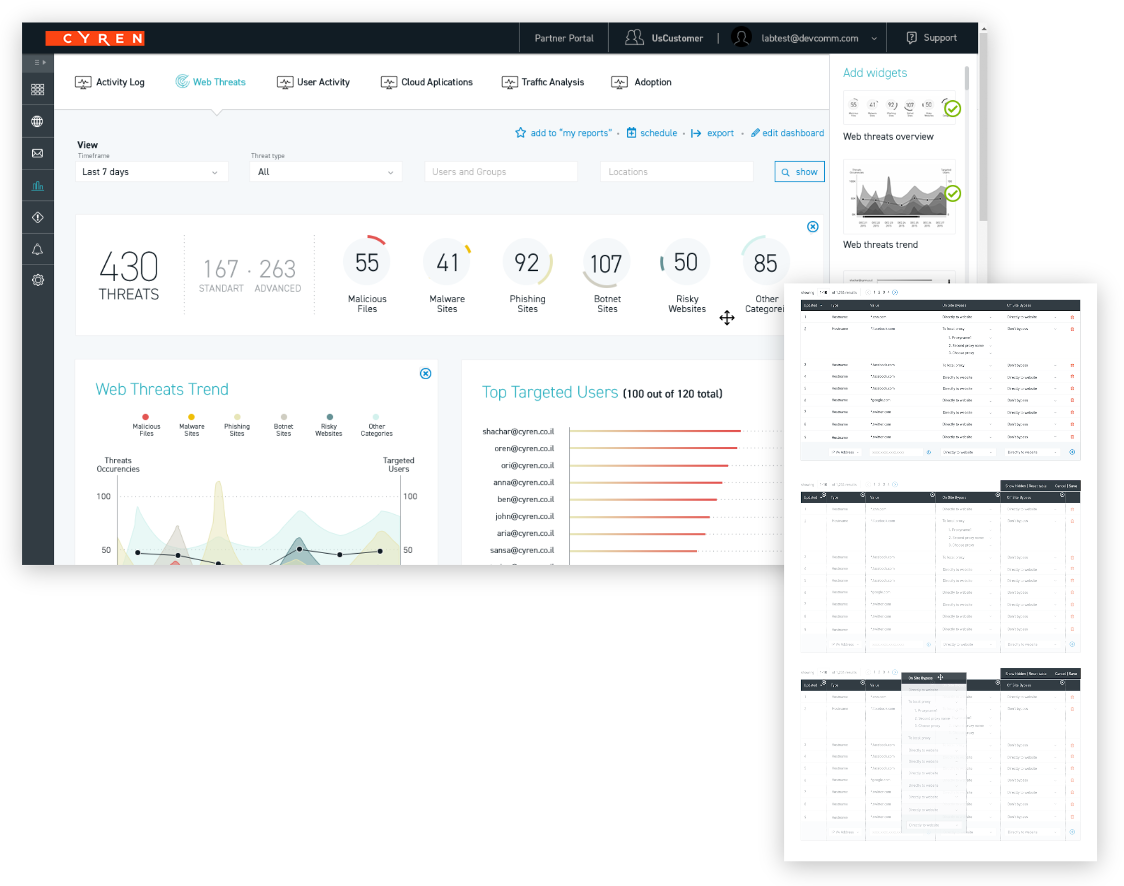
Control
We wanted to give much more control to our users by allowing them to customize tables, dashboards and reports. The user could choose to export those reports, so I also created a focused, simplified version for PDF reports - where there is no interaction and no drill down.
Design System
Given the development effort that went into this redesign, I created a system of generic elements Cyren could use for new features in the future and defined how things should look and behave in different situations.
