Wix Platform
A new way to build applications for the Wix Editor and extend the Wix ecosystem, using native Editor components and relying on predefined behaviors and abilities.
To comply with my confidentiality agreement, I have omitted some information in this case study.
- Role
- UX designer on the Wix Platform team. I joined early, replacing the designer who started the project, and worked with several PMs and developers to set up the infrastructure for it.
- Where it landed
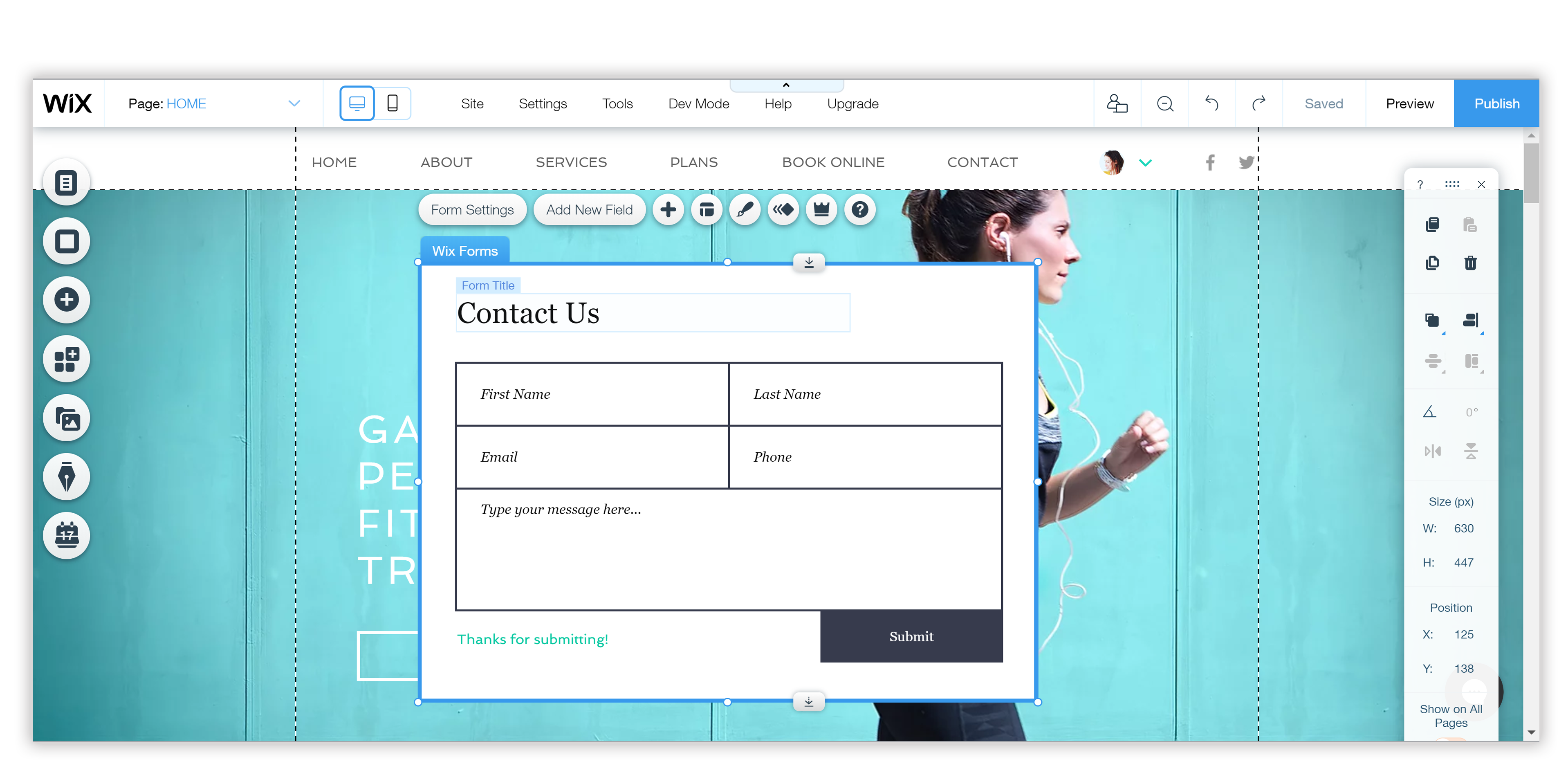
- The first full-platform app, Wix Forms, shipped in the Editor, with more Wix apps moving onto the new Platform. Once we shipped, we could start watching real usage to test some of our assumptions.
Patterns
- Complex systems. Systematically mapped and defined the rules for a whole new kind of app living natively inside the Editor: what it can override, how it behaves on stage, how it works with the Editor’s code layer.
- End to end. Designed the full end-to-end experience across the journey for all user types. Guided other Wix teams migrating their apps onto the Platform, and fed their requirements back into our roadmap.
Background
Wix: a DIY, drag and drop website builder. The Editor: Wix’s core product. Other than the Editor itself, Wix has teams working on many applications and business solutions for Wix’s users.
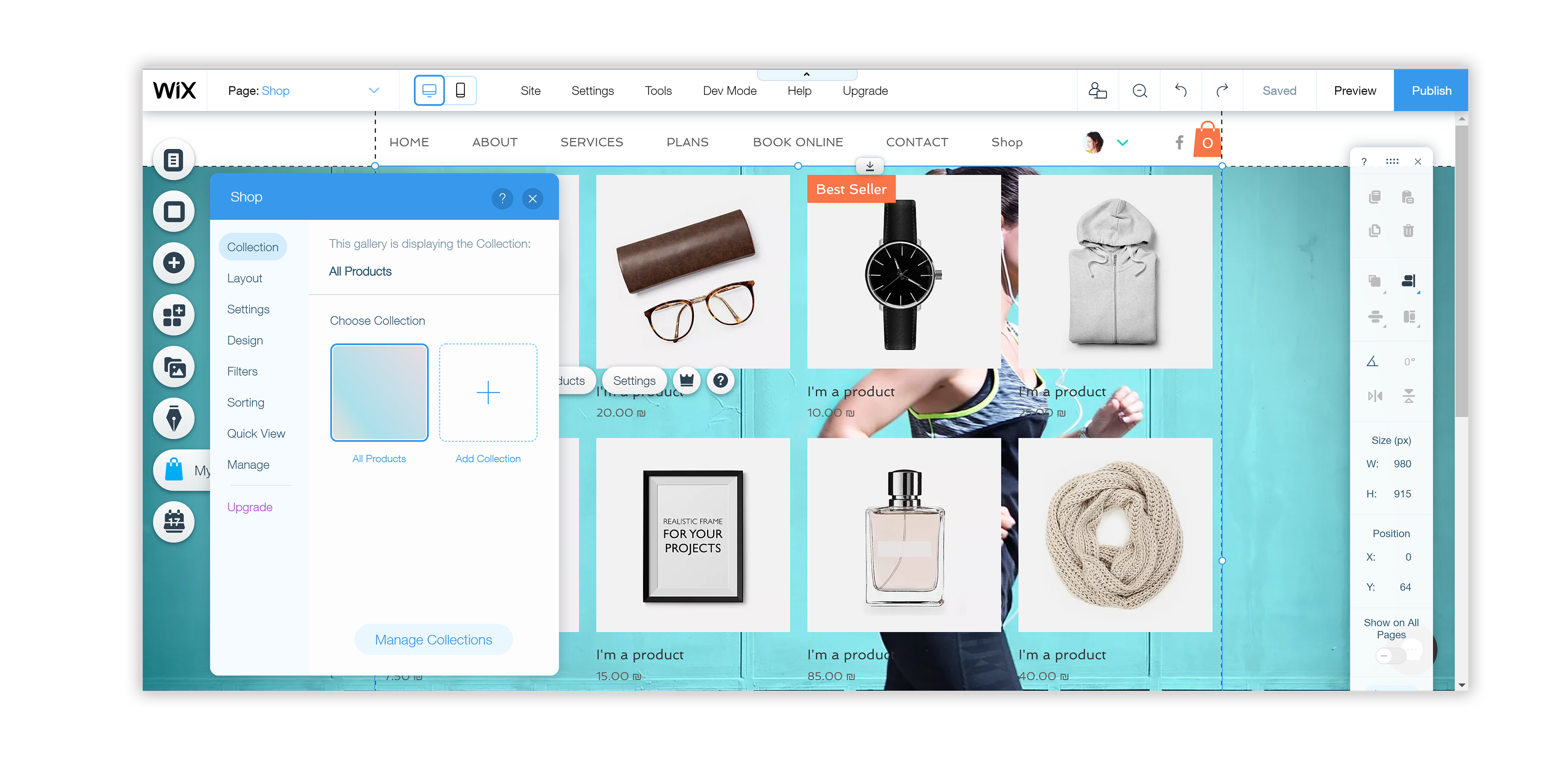
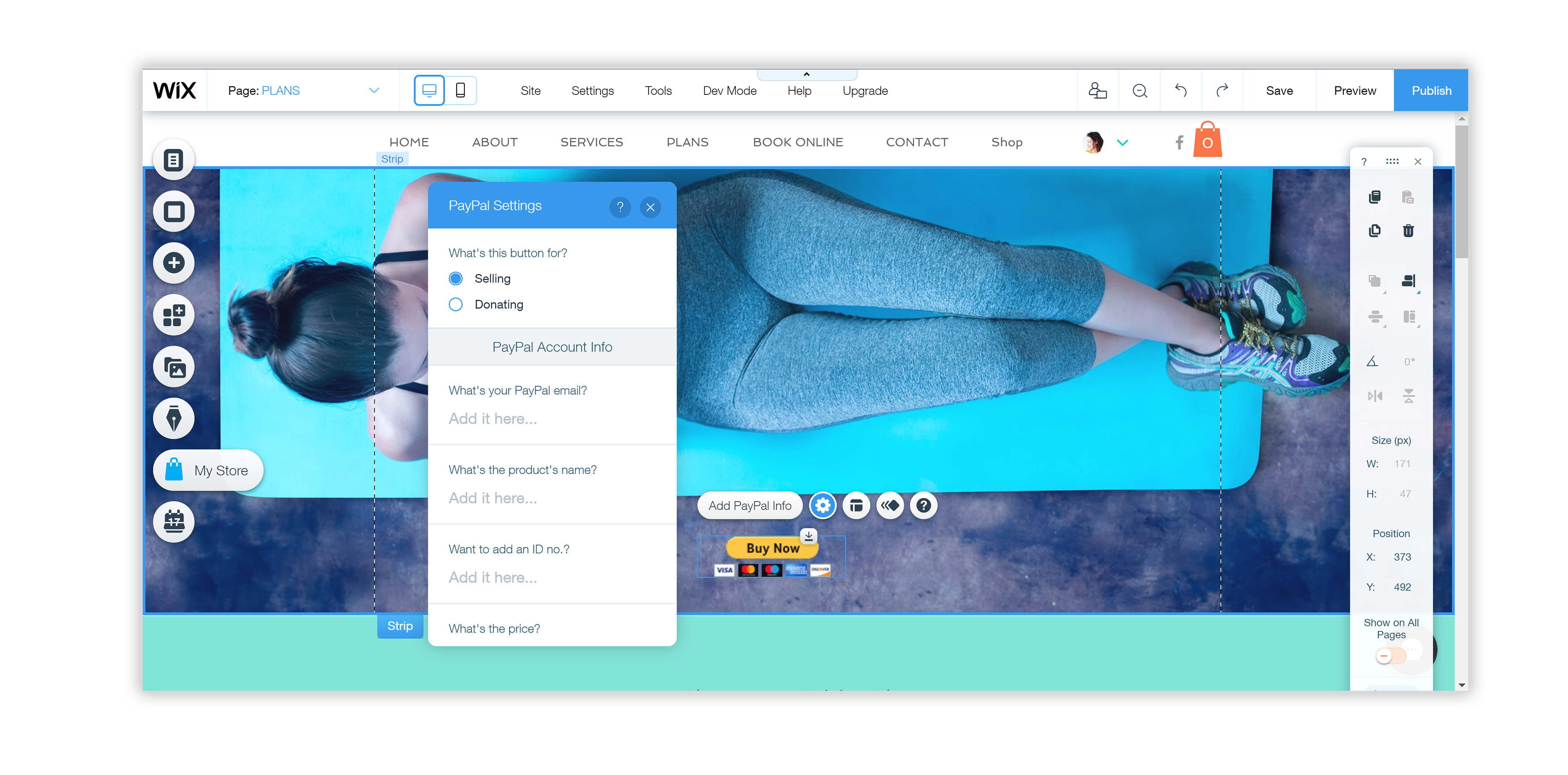
In the Editor, a user can have applications. Applications can be different: some built by Wix and some by 3rd party developers. Some are big, like Wix Stores, which includes several pages, databases and components, and some are small, like a single “PayPal button” component. Each component or app in Wix has main actions, on-stage indications (type of bounding box, labels), panels and a certain set of behaviors.
The Platform Team & My Role
Up until the Platform project, applications were running inside an iframe and were completely separated from the Editor. This meant every team, 3rd party developers or Wix teams, had to develop everything from scratch, and nothing could be reused. We wanted to let developers build inside the Editor using native Editor components and panels, relying on predefined behaviors and abilities.
I joined the team at a very early stage, replacing the designer who started the project, and worked with several PMs and developers on setting up the infrastructure for it.
Goals
We had several goals for this project:
- Improve speed and performance
- Speed up development by allowing reuse of components and behaviors
- Better SEO
- Create a consistent experience for both Wix users and users-of-users
- Make every element fully customizable (users can’t control items inside an iframe)
Our Users

Application Developers
Developers in Wix working on Editor apps, plus 3rd party developers with apps in the App Market.

Wix Users
Anyone installing the app on their site, designing it in the Editor or managing it in the back office.

User-of-User
Site visitors using the app, filling up the contact form or buying new sunglasses.
The Process
I worked together with PMs and developers on defining the rules for this new type of application, defining the missing features, prioritizing and designing them, and creating the documentation.
I was also responsible for meeting UX designers and PMs from the other teams to help them migrate their apps: guiding them on the Platform, the Editor Design System and the Editor UX guidelines, reviewing their work, creating processes for working together, and gathering their requirements to see how they could fit into our own roadmap.
Research
I wanted to understand what types of apps we had, how the development process looked for developers, how apps were being used by our users, and how other app builders approach this. This involved:
- Talking to other teams in Wix working on applications, and the App Market team, which is in charge of 3rd party app developers.
- Gathering data from BI and Support.
- Understanding how the communication between the Editor and the apps works, along with the problems and the limitations.
Prototypes
Early in the process, we created a few prototypes, some in InVision or even on paper, and some with the help of the prototyper on our team, to feel the behaviors we were debating. We tested them simply by showing them to the other teams, who were, effectively, our potential users.
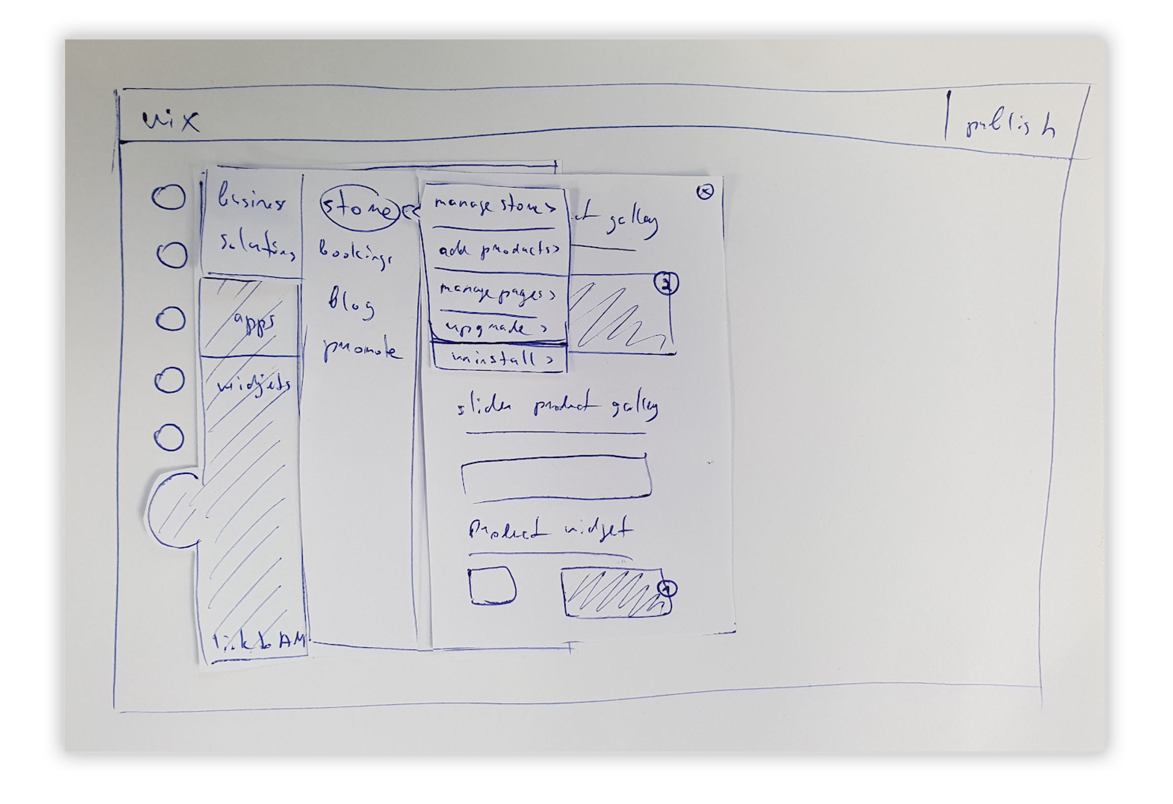
Platform Rules & Application Widget
We started with defining the rules: what the application can or can’t override, in actions, panel parts and behavior on stage. Then we needed to define how applications would be added to the site. We created a new “Application Widget” that has its own set of indications and behaviors and “knows” how to work with the elements inside it and with the app logic.
The biggest problem we had to solve was how, and whether, to explain to the user that this is an app and not a regular component. There were a lot of questions to answer.
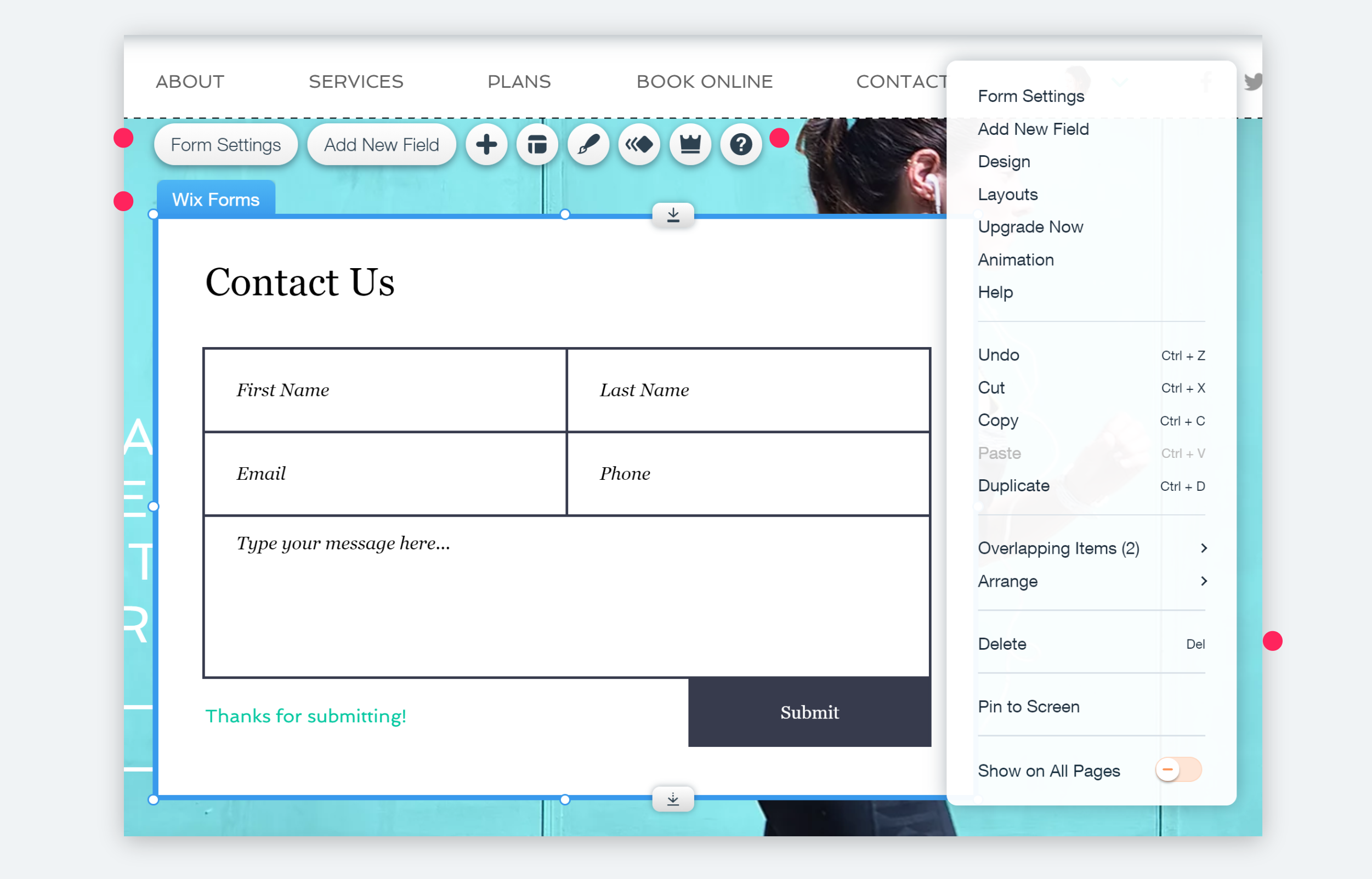
How would main actions work, and how would a developer decide which ones are available? How would they name and label the components? How would a developer define whether an element can be rotated or resized? Should a developer be able to leave out a link to a “help” section? What would be accessible through the right-click menu?
What happens when the user clicks on an element inside an app, something that wasn’t possible before? What happens if the user tries to drag an element outside the App Widget, or move that element to a different page using cut and paste?
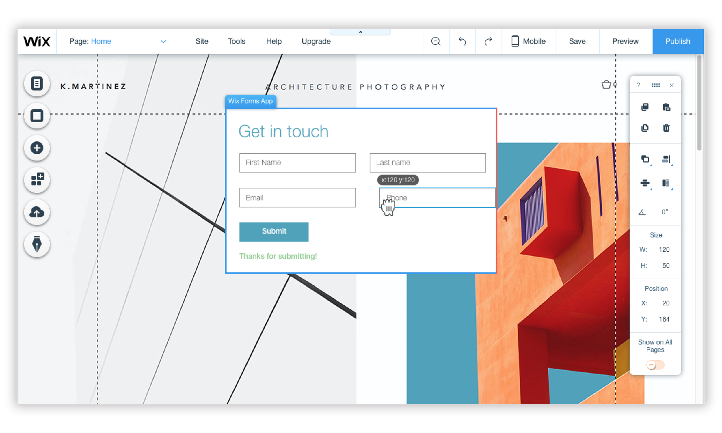
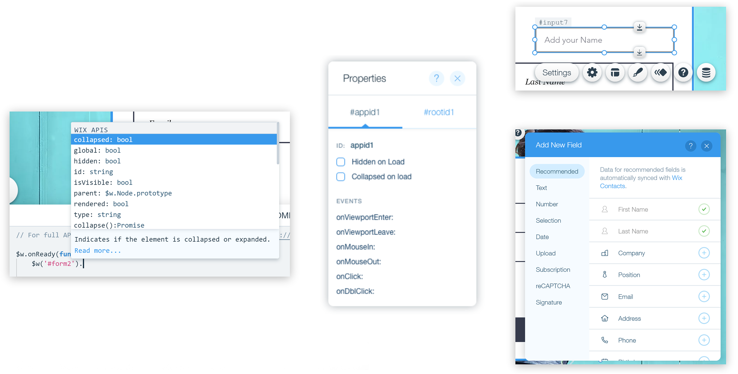
How would the user know which element belongs to the app and which doesn’t? A regular input field can look the same as the input fields inside the app, but the app doesn’t know what they are. How would the user add new elements the app can work with?
And how would all this work with Corvid, Wix’s way of writing code to enhance sites? For examples: there is a set of actions that works with the app and another that works with the container itself, and therefore two IDs. We had to decide whether to expose both, or create a single ID and a new way for developers to reach the different actions.
Main Takeaways
Since the launch, a lot of Wix apps have moved to the new Platform. Once the first full-platform app (Wix Forms) was in the Editor, we could start watching how our users interact with it.
My main takeaway from this project was to remember to solve the right problems. We spent a lot of time trying to find the best way to show users the difference between an app and a component. Eventually we decided to go without any visual indication, just a different behavior, with the assumption that we could always add one later if a problem showed up. After watching users work with the applications, we realized the different behavior was indeed enough, and any visual indication would only add clutter and confusion.