EditorX by Wix
A fully responsive drag and drop website builder, aimed at design professionals.
To comply with my confidentiality agreement, I have omitted some information in this case study.
- Role
- UX designer, later took on some PM work. ~100-person team at Wix, late 2018 to mid-2020, joining shortly after the initial POC.
- Where it landed
- Beta invites went out in March 2020, while I was on the team. EditorX later grew to hundreds of thousands of registered users, a lot of them the professional designers we were after, and the OFFF Barcelona 2021 site was built on it.
Patterns
- 0 → 1. A brand-new, fully responsive editor paradigm - plus AcademyX, the lesson library we built to teach it.
- End to end. Took on PM work when we were short on PMs, then made integration easy for new teams - so we shipped more apps than originally planned.
- Complex systems. 200+ components, custom breakpoints, and integrating four business apps.
Background
Wix: a DIY, drag and drop website builder.
The Editor: the regular Editor - Wix’s core product. No support for responsive design (except a few specific components).
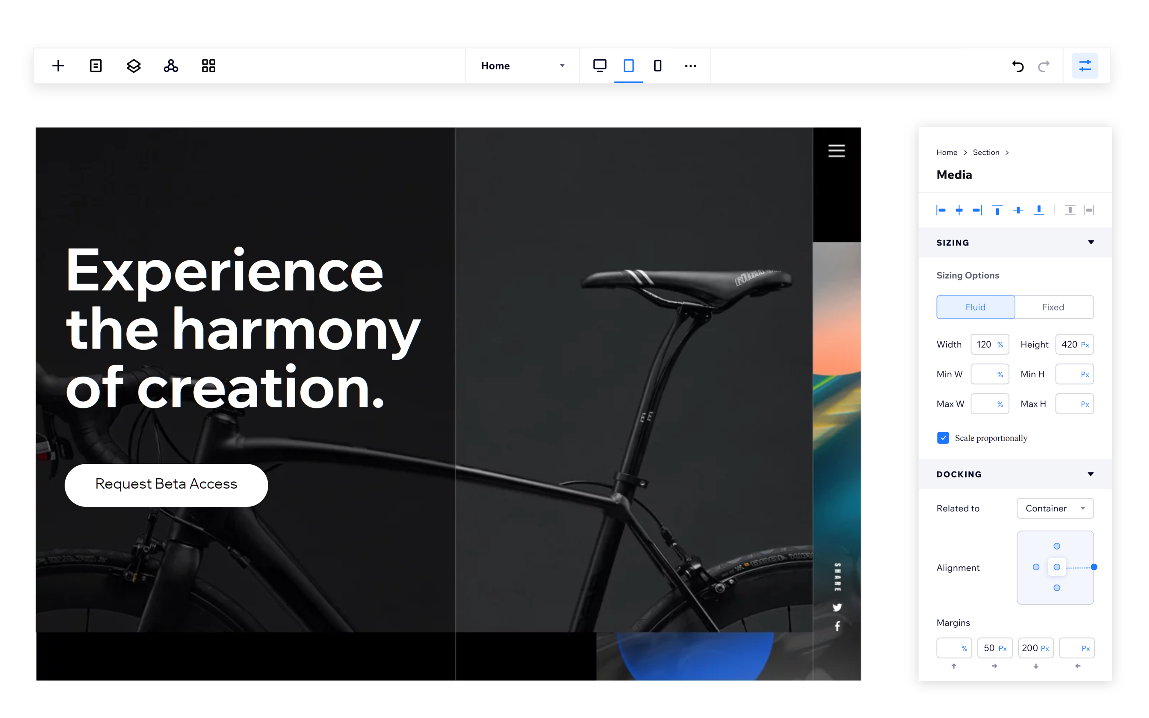
EditorX: a completely new, fully responsive drag and drop website builder, aimed at design professionals.
EditorX gives its users full control over every aspect of their sites, allowing them to build fluid sites with flexible grids (using CSS grid and Flexbox) and design tailored for each viewport with custom breakpoints. The users also have access to all Wix’s business solutions and Corvid (Wix’s way of writing code inside the Editor to add more functionality and enhance the site).
My Role on the Team
The team working on this project comprised around 100 developers, PMs, UX designers, visual designers and UX writers and the project involved working closely with many other teams in Wix across the globe.
For Wix - this is a way to reach a new target audience, one that has needs and expectations that are very different from the DIY users. For us, it meant understanding new tech, learning about a new type of user and incorporating all the regular Editor’s strengths into the new EditorX - all on a very tight timeline. This was both an incredible engineering effort and serious challenge for the rest of the team. Our main goal was to allow our users to create a fully responsive site with no understanding of the tech behind it - and without losing any of the design freedom of a drag and drop Editor.
Joining the team shortly after the initial POC stage, I worked on defining how different components will behave in the new EditorX. In the process, I took on some PM responsibilities and was in charge of several Wix Applications integration. I was also responsible for guiding other teams in Wix and helped create AcademyX - a library of interactive lessons teaching the concepts of the new Editor.
Our Users

Design Professionals
Familiar with design tools, can invest in learning a new tool, require a high level of control to achieve a specific design. Usually no coding knowledge.

Agencies
Require collaboration tools, sometimes will work with professional developers. High volume - a lot of projects at the same time.

Designer’s Clients
Will need to be able to run their business with the site that was designed for them; some will pay for maintenance and some will do their own editing.
Components
My first task was to research how the components we had in the Editor would work in the responsive EditorX.
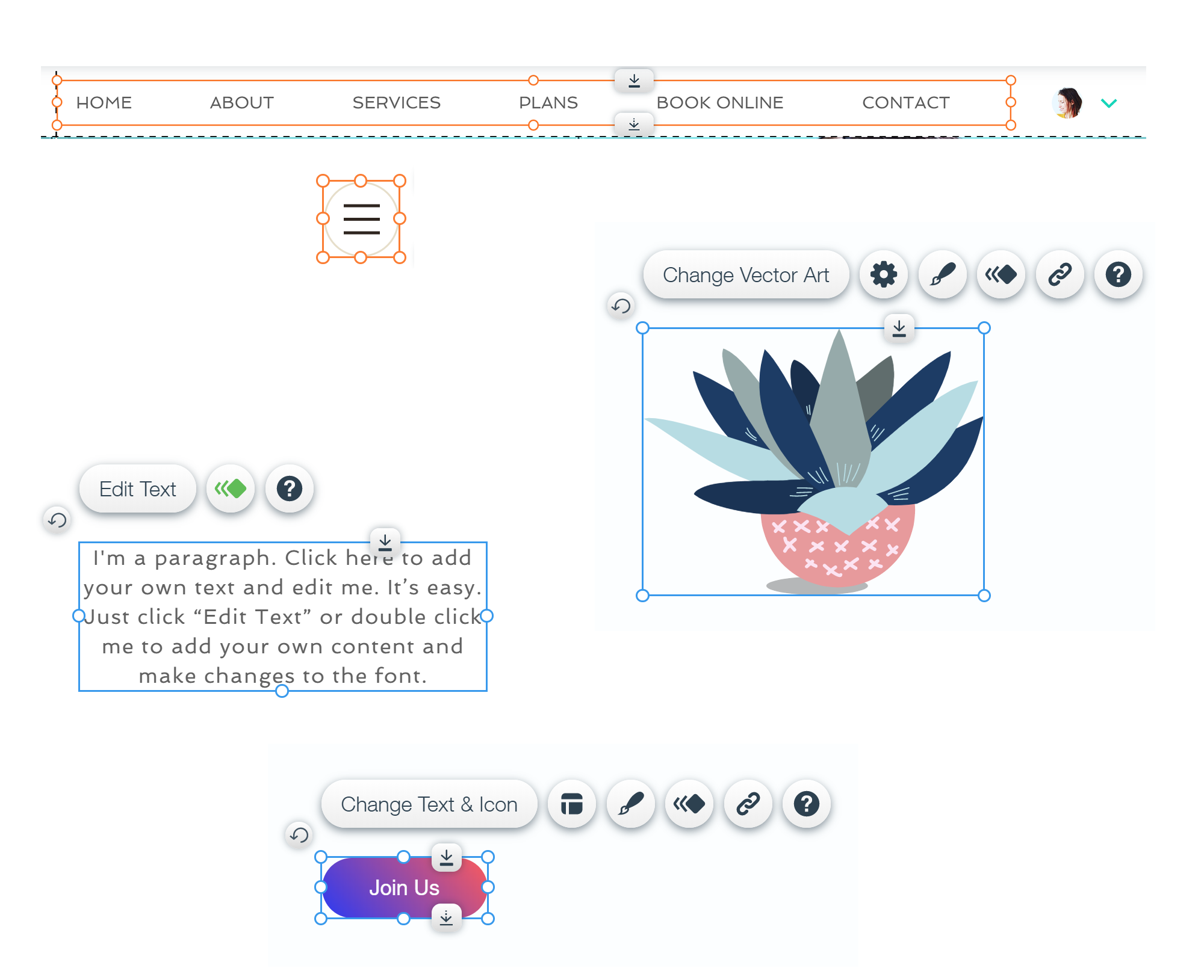
Components range from something small, like a button or a text box, to something complex, like a lightbox or an HTML iframe. There were over 200 of them in the Editor. This involved mapping out and analyzing the current components, their characteristics and how they were developed. For example:
- Can they work with a fluid width
- Do they have media or text that require “special” treatment
- Can they be connected to data (pulling the content from a database - which could lead to unexpected results)
- What style characteristics they have
- Do they have special mobile settings
After mapping the components and analyzing our competitors I wanted to check how designers work with responsive design in general and what are the current trends and expected (default) behaviors.
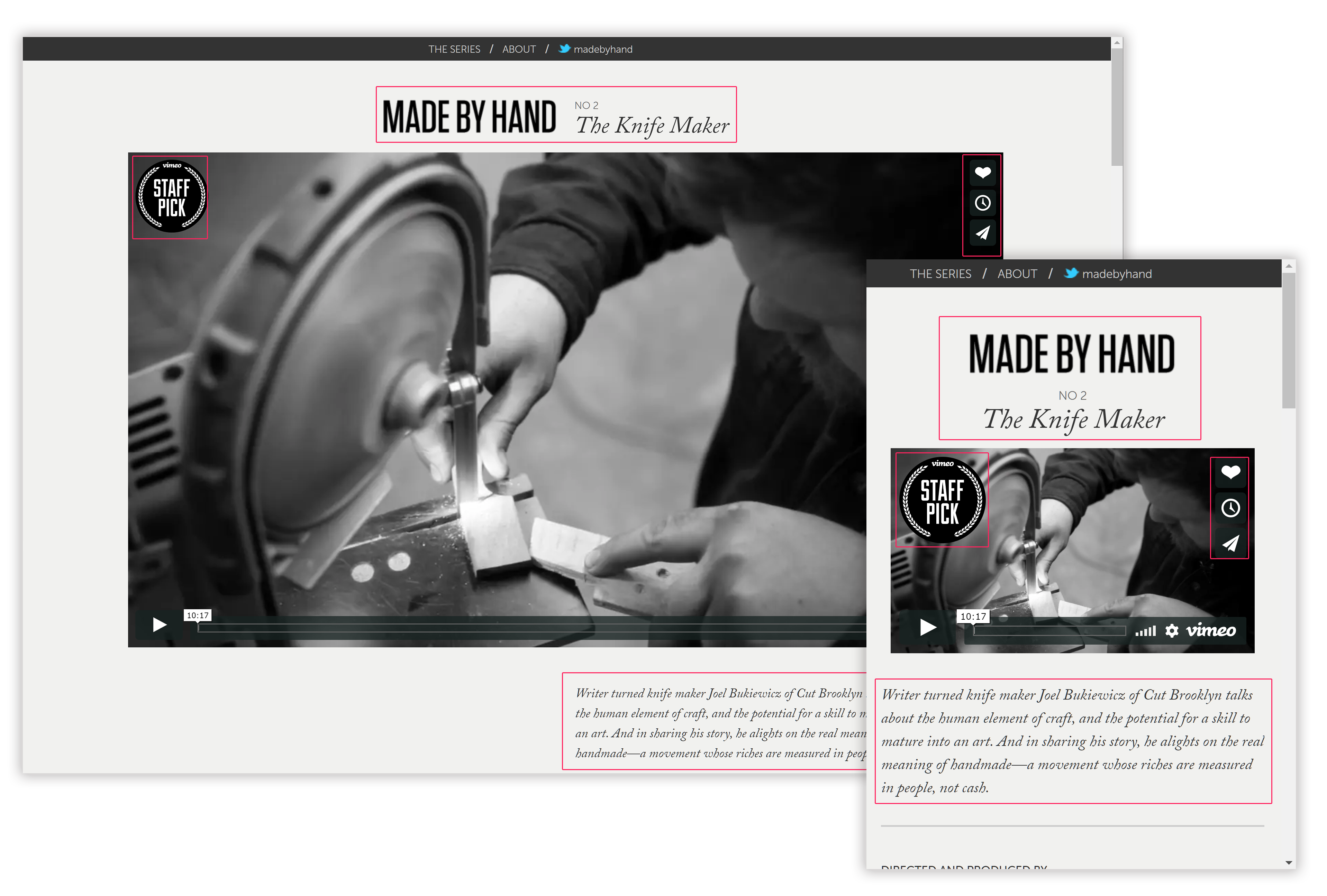
For example: How do images behave? What happens to menus or galleries? Are buttons fixed or fluid? Does the text on buttons scale when the browser is resized? What about titles and paragraphs? What happens when breakpoints change? How do different units, such as em or vw, come to play?
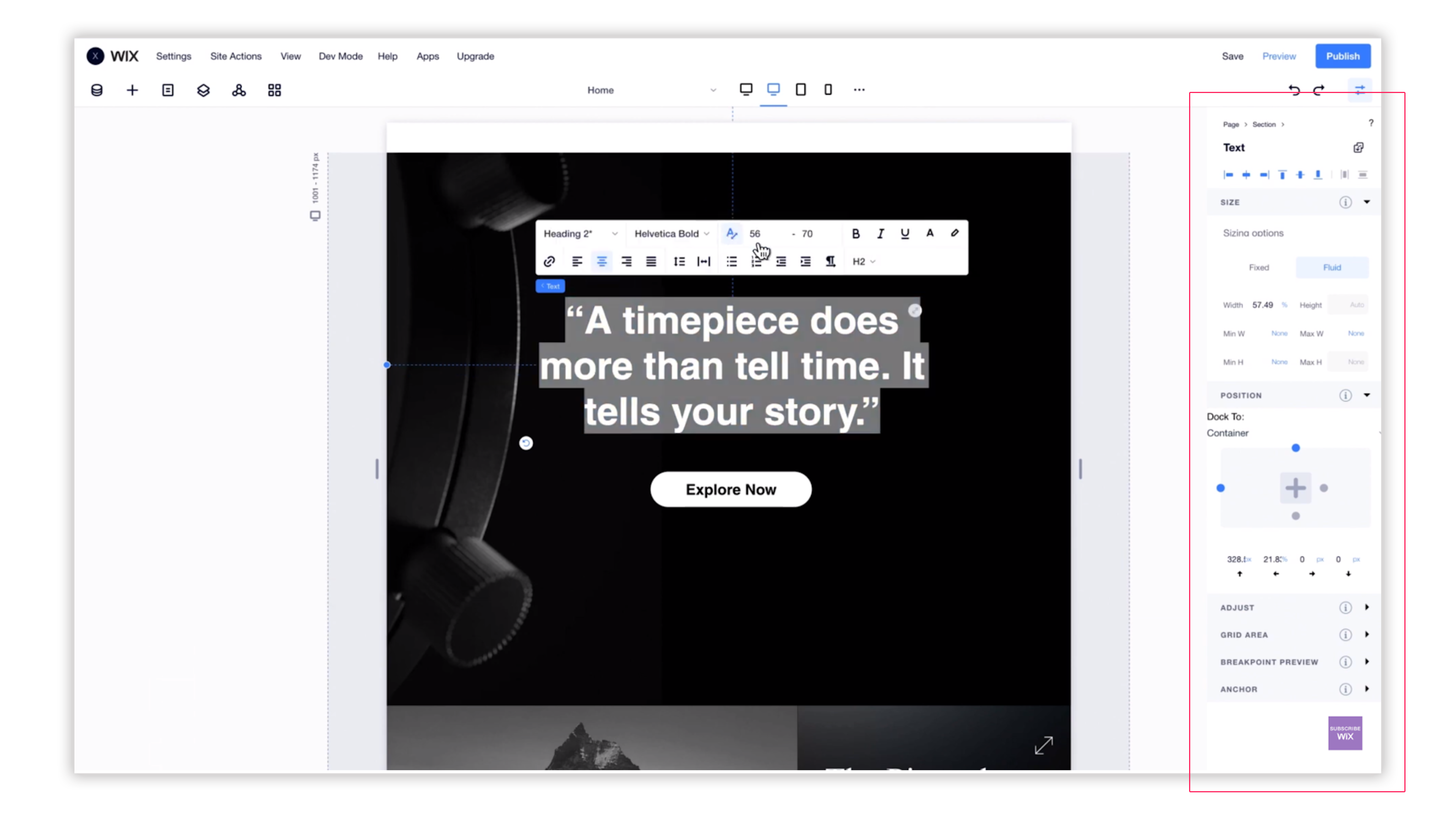
The research helped us make the decisions on component characteristics and default values for each. Every component can be set up as fluid or fixed width. Each one comes with different default settings. The user can use different units, like vw or % and set min/max width and height. For some components, some of those settings are disabled.
Special attention was given to how we translate mobile definitions (in the Editor, the user can only set certain things in a separate “mobile mode”).
Some components, like the lightbox, required creating new user flows and redesigning their settings panels, since the workspace and some of the technical infrastructure was changed; some, like the HTML iframe, got minor product and UX improvements that we could do easily taking into account development times, deadlines and data we got from our BI team about the component usage in the regular Editor.
Applications Integration
I started working with our PMs on the integration of one of the Wix Applications - Wix Forms. I later took on some of their tasks (we were short on PMs at that moment) and was in charge of the entire integration process of several business applications: Events, Blog, Forum and Groups.
This involved analyzing and documenting the full flow for each application - installation and deletion, management, adding and removing pages and widgets, the definitions for each component and adjustments to behavior and panels. Each app could have different definitions and settings for different breakpoints which needed to be addressed. I was responsible for communicating with the teams working on each application, following the development process and guiding PMs and UX designers about the new EditorX.
Later, when new teams came to me about their own products, I made sure they could get through the process easily. That’s how we ended up integrating more apps than originally planned.
Usability & Talking to Our Users
The project started with conversations with some of the big US agencies, trying to understand what would get them to move to Wix. Responsive was one of the biggest things holding them back. From the POC stage and all the way through, talking to our users was the thing we cared about most.
Our team has been in touch with a selected group of “alpha” users - mostly agencies and design professionals. This allowed us to gather feedback early, learn, prioritize and iterate every step of the way. Our team did user interviews and usability testing on a few specific milestones, both through video and in person, and we could really tailor the product to our users’ needs.
Other than that, before releasing the real Beta, we had a chance to see first hand how our product is being used day in and day out by our own studio designers - the ones designing and building Wix’s templates. This has been invaluable, since it wasn’t confined to short sessions and the users were doing their real work instead of a specific exercise. We could see how different features are being used - sometimes, not in the way we intended; and which parts aren’t clear enough, so we could improve those even before the launch.
After launch (beta invites started going out in March 2020), we kept talking to users every day, over a community forum, our feedback tool and video sessions. Some of those sessions were rough. We even found a completely different type of user than the one we were aiming for: a lot of the professional builders weren’t designers at all, and worked in completely different ways. It changed the relationship, too. Instead of struggling with a new product on their own, users could see the team was listening, and a lot of them turned into our biggest advocates.
My biggest takeaway was how valuable it is to go beyond usability testing. A short guerilla test with 5 users can still get great results for a specific question. But that open, ongoing channel is what helped us make better decisions through the whole process, and after launch.