QuickBooks Bill Pay / Instant Payments
Growing adoption of instant payments in QuickBooks Bill Pay by running 11 different experiments across 2 quarters.
To comply with my confidentiality agreement, some details and numbers are omitted.
- Role
- Design lead for instant payments adoption across Bill Pay, 2025–26. I took over the project after launch and owned the design through a change of PM along the way.
- Where it landed
- 6/11 experiments shipped at the time of writing. Some lifted instant adoption as expected; the misses reshaped where we invest next.
Patterns
- End to end. 11 experiments across the whole payment journey, from choosing which bills to pay to tracking them afterward.
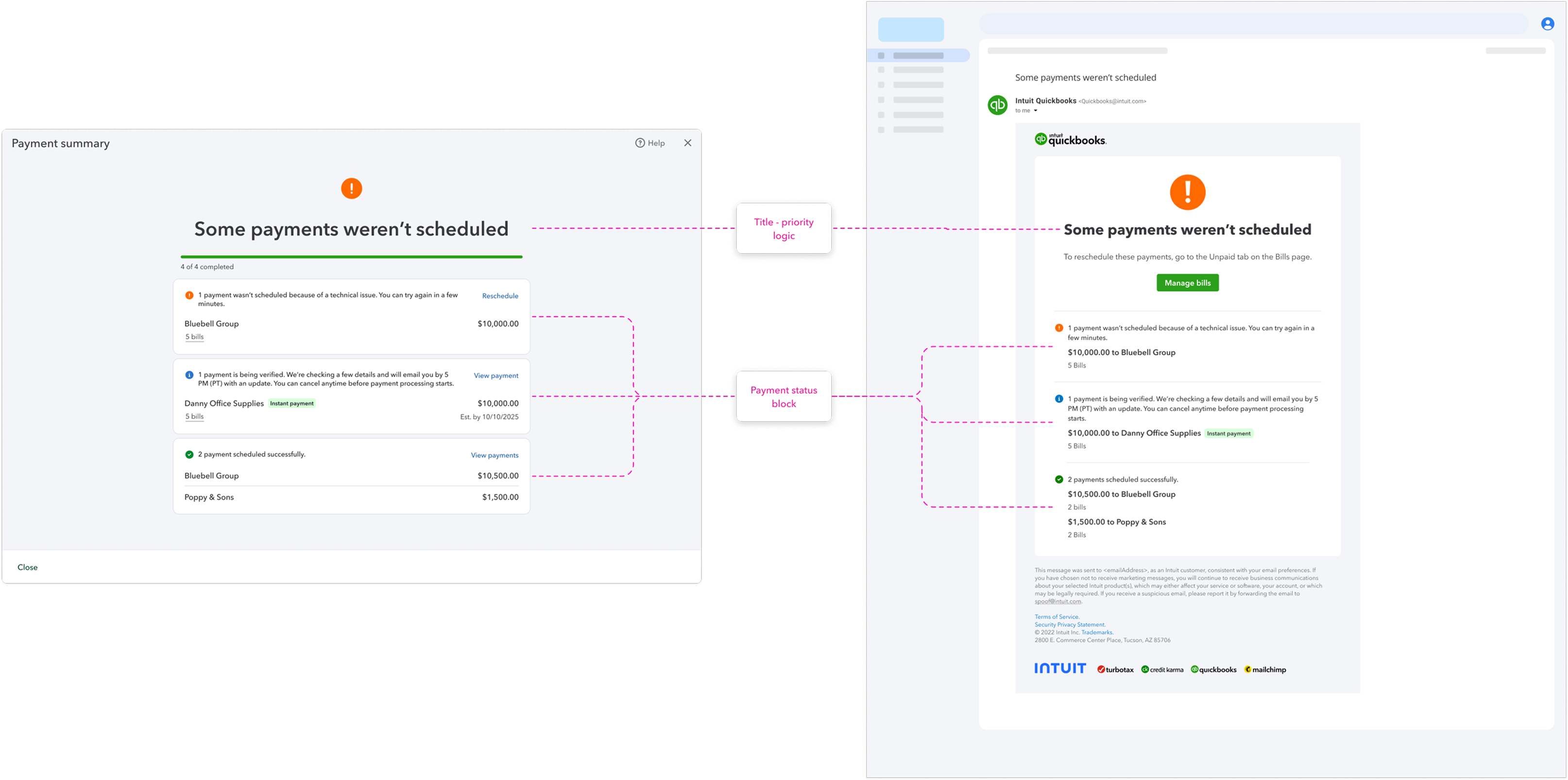
- Complex systems. Since Bill Pay launch, new payment statuses were added to the post-payment screens until they became hard to follow - and to maintain. We took one of the experiments as an opportunity to align every case, in product and in emails, to the same logic.
Background
Instant payments (aka real-time payments) is a faster payment speed eligible customers can choose when scheduling a bill in QuickBooks Bill Pay. While the default standard ACH can take two or more business days, instant payment transfers the funds immediately, which makes it useful for time-sensitive, high-value, or last-minute payments. It comes with a per-transaction fee.
For our customers, instant payments unlock three core benefits: faster funds delivery and confirmation, better control over cash flow, and fewer late payments, leading to fewer late fees and stronger vendor relationships. For Intuit, instant payments increase revenue through the transaction fee and keep us competitive with platforms that already lean heavily on instant rails.
Instant had launched not long before I joined the project, but adoption was lower than expected. To understand why, we looked at both behavioral data and customer interviews. Our analyst built a detailed picture of where adoption was breaking down, the PM and I interviewed customers, and putting the two together helped us define the ideas and the specific roadmap.
Right Place, Right Time
Our data showed that the companies who did use instant payments were mostly mid-market, with higher payment and bill volume. Our primary persona was the owner: owners are the ones who feel the personal connection and the social pressure of paying their vendors on time and keeping a good relationship. Interviewing these customers captured the core need: often, the owner doesn’t get their money for 60 to 90 days after the work is done, so when it finally comes in, they want to pay immediately. In other cases the urgency came from a sale that had to happen that day, or goods that couldn’t be delivered until the payment went through. Either way, there was enough urgency to make the extra fee worthwhile.
Talking to our users made us realize something else: the problem wasn’t the value of instant payments, it was discovery. One of them put it plainly: “…instant pay was nice because as soon as I had the money come in, I was able to get it over immediately.” They also mentioned discovering instant payments by chance, and because their cash flow depends on incoming payments, they wished they had known about it earlier. In-product feedback said the same thing: once people found instant, they were happy with it. So the real issue was surfacing the option at the moment urgency was highest.
There was one clear miss: we already had first time use messaging in the product, but I noticed we were showing it only once per company rather than per user, so the person who saw it often wasn’t the one paying the bills. Fixing the audience was a good first step.
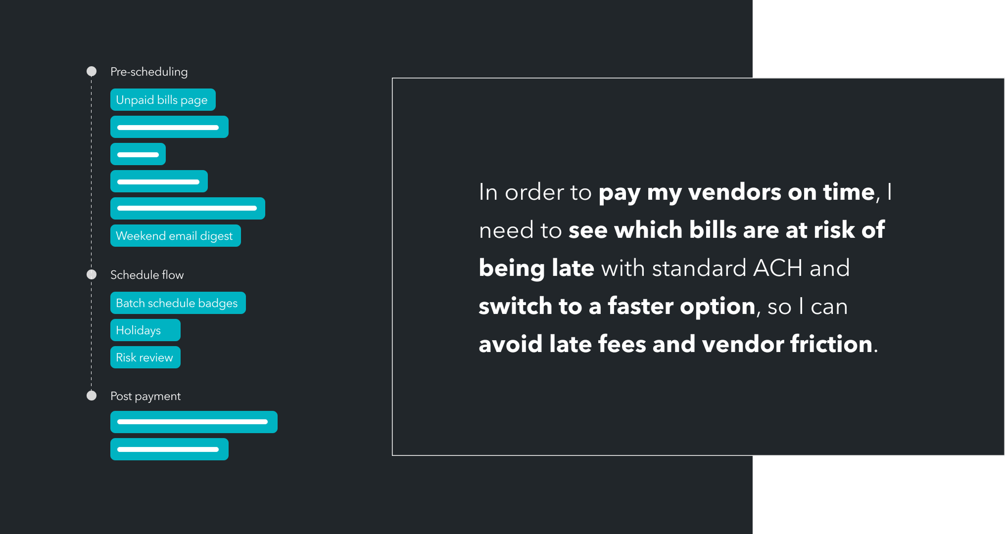
Looking at our JTBD and the tasks behind it, the journey has three key phases: choosing which bills to pay (pre-payment), scheduling payments, and tracking them afterward (post-payment). Based on our usage data, we mapped the surfaces in each phase where instant payments would fit naturally, and defined eleven experiments to run over the next two quarters.
Late > On Time
The first experiment lived in the scheduling flow, where someone chooses how to pay. We knew from the data that people are most likely to choose instant payments when they schedule exactly on a bill’s due date, when urgency is highest, so the goal was to clearly show which payments would arrive late on the standard speed, but on time with instant. After testing several options, we introduced badges on the relevant payments, but only where paying instantly would actually make it on time, and deliberately not on payments that were already overdue: a screen full of warnings you can’t act on is just noise.
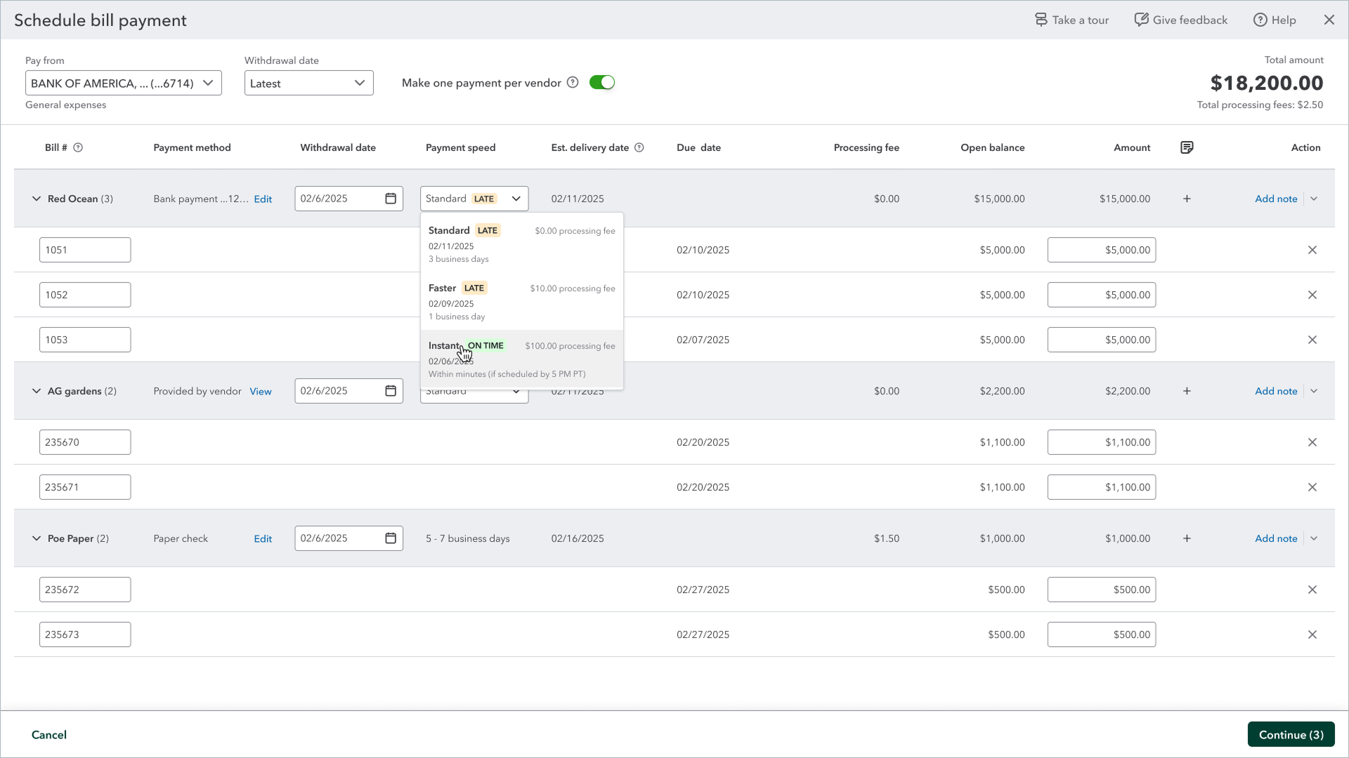
The version we wanted relied on a shared component that wasn’t ready yet, so we worked with the design system team to contribute the pattern back to the system.
Tying the signal to the speed option put both the problem and the solution in front of people at the moment they needed it. Engagement was high and instant usage in that flow went up, which made this experiment a success.
The next experiment sat one step earlier in the journey, where people choose which bills to pay. Unpaid Bills is the top entry point for scheduling bill payments, but instant usage there was much lower. The page already carried an urgency signal, a “due today” status, so we made a few changes. We pulled the status icon back to only “due today” and “due tomorrow”, so the cases that matter stand out and the rest is quieter. And we added a “pay on time with instant payment” link, the same problem-to-solution move that worked in the scheduling flow, making it clear early in the flow that instant is an option. The page didn’t know a vendor’s instant eligibility out of the box, so we made sure that got brought in, which let us surface the option only when it’s genuinely relevant.
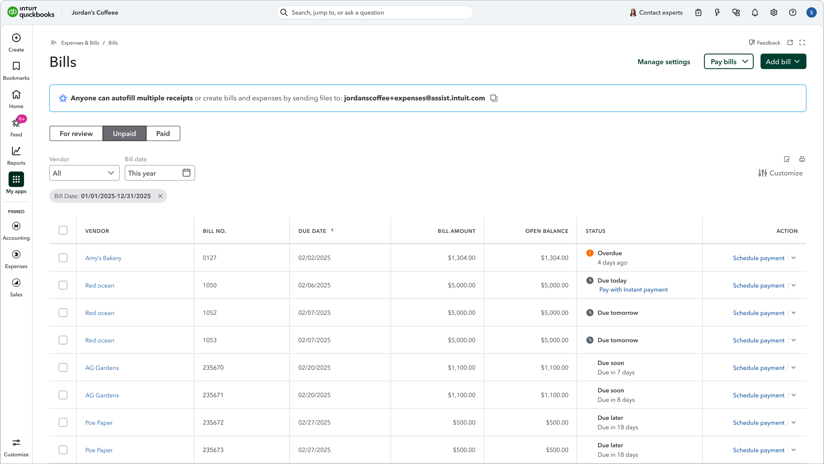
This experiment drew good engagement, but it didn’t hold up on the main metrics we were measuring. We rolled it back and stepped back to understand why, and lined up several variations to keep testing and learn from, since most of what they needed was already built.
Timing
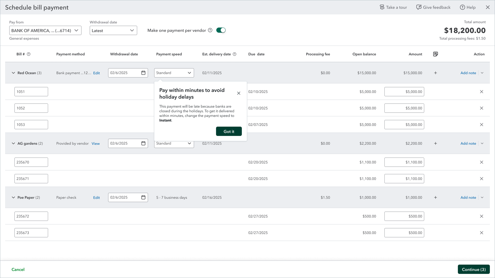
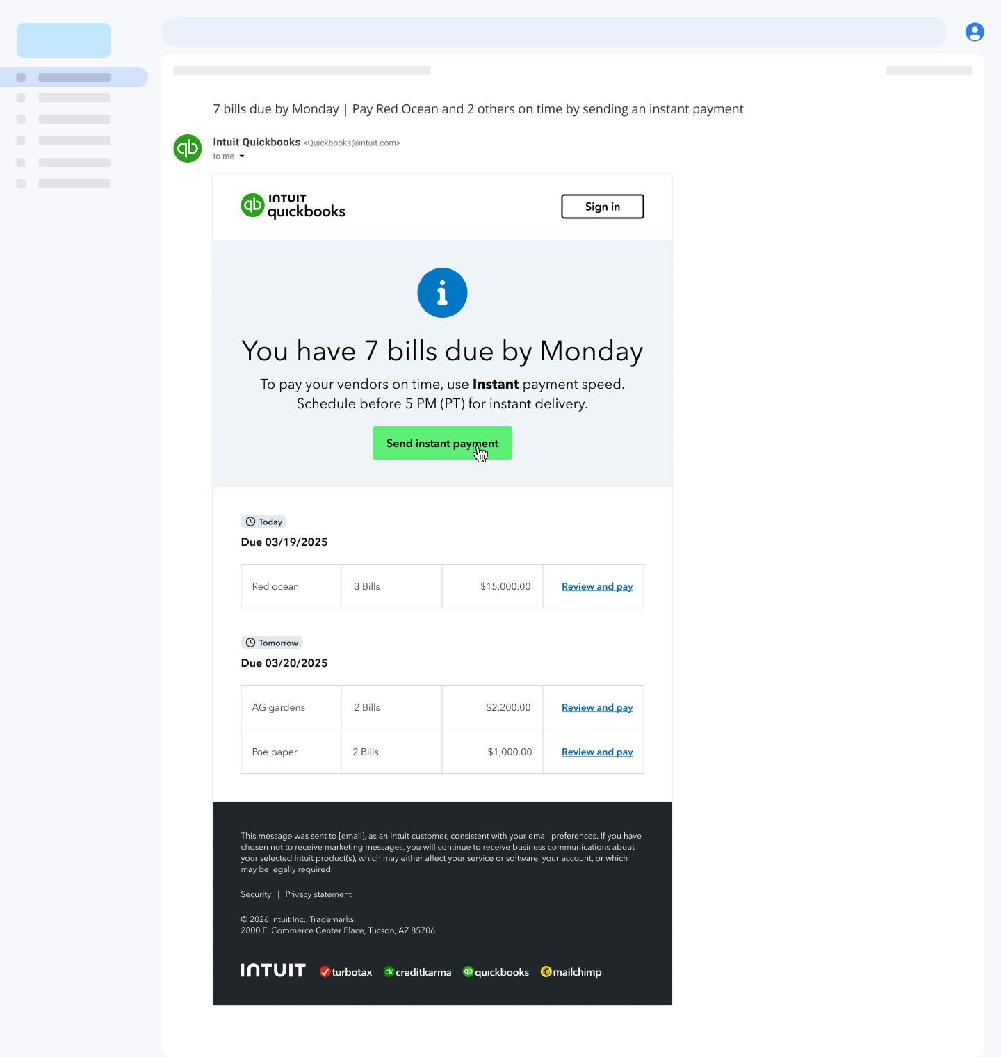
Another direction we tested was the timing. The data showed people use instant payments more right before a weekend, when a standard payment would otherwise sit until the following week. Around the December holidays we tried messaging like “pay in minutes to avoid holiday delays,” which worked. A Friday email digest along the same lines however, didn’t win on the metrics we were watching.
Post-Payment Confirmations
A different direction looked at payments that would normally fail the risk checks and not go through. Rather than have those simply stopped, we explored giving them a path to be reviewed.
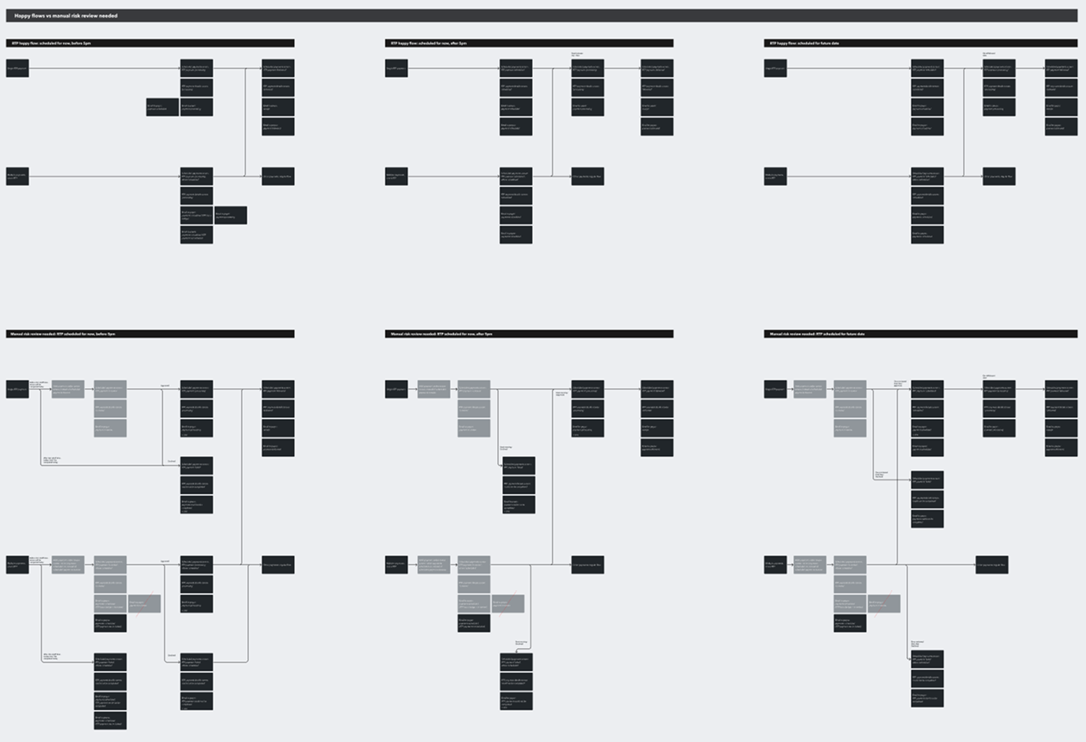
The review work touched a lot of screens and had a lot of edge cases, but the bigger thing it surfaced was that the post-payment confirmation screens, and the emails, were never designed for this much complexity. Several new statuses and cases were added since Bill Pay launch, and since a single confirmation might cover one payment or several, in the same state or a mix, it had become hard for customers to follow and hard for us to maintain. Our team already had a concept for a better version but we couldn’t build the whole new experience on the timeline we had.
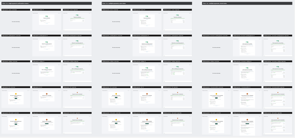
Instead of waiting on the redesign, I proposed aligning how the content behaves across all of those cases, bringing every post-payment confirmation, on screen and in email, onto the same logic. Looking at data we had on common usage allowed us to align around how people actually pay. This alignment also made it much easier for the team on the next project to reach the target state.